Fintech
Insurance
+26%
Sales increase
+9pt
Completion rate
6mo
Duration
ABOUT THE COMPANY
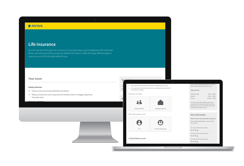
Aviva is one of the UK's largest insurance providers, serving millions of customers across life, health, home and motor insurance. The life insurance team operates within a highly regulated environment where even small changes to the quote journey require sign-off from legal, compliance and risk.
The design we shipped went against the initial business hypothesis and outperformed it. Here's how we got there.
THE CHALLENGE
Life insurance should be one of the easiest products to quote for, very little information is needed to generate a quote. Yet quote completion rates lagged behind far more complicated products like Home and Motor.
40% of customers were dropping out before getting a quote.
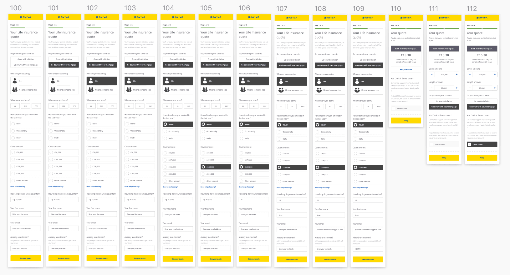
The business had a hypothesis going in: reduce the number of questions, update the design, and completion rates would improve.
Goals:
Simplify quote completion
Increase quote completion rate
Improve description of quote summary
Clarify cover options, amounts, and types
MY APPROACH
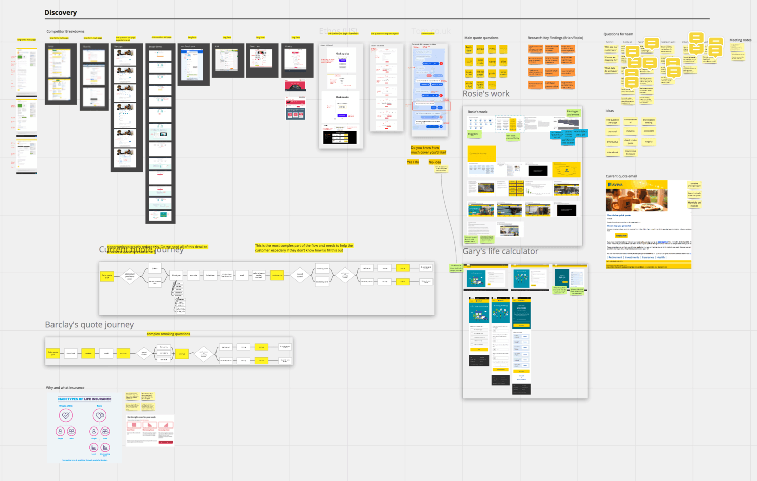
I led UX across a cross-functional team including a UX researcher, visual designer, data science, propositions, legal, compliance and risk. We started by reviewing previous research and recent testing sessions which revealed four key customer pain points.
Pain points identified:
Customers didn't want to give personal details upfront
Confusion over cover types: increasing vs decreasing
Too much copy throughout the journey
No apparent ability to edit quotes
Design and iteration:
We stripped the form back to only essential fields. But when we tested the simplified version something unexpected happened. Testers felt the process was too fast and didn't feel accurate. They wanted more context around each field, not less.
The cover types were another problem entirely. Working with our propositions team we redesigned the offering itself, not just the UI. We introduced options that actually made sense to customers without jargon.
RESULTS
The new journey launched in December 2019 alongside the existing journey shown to 50% of customers. It outperformed immediately and the decision was made to go 100% live within the quarter.
Additional outcomes:
Critical life insurance added as an option. Customers typically purchase this alongside life insurance
Success led to working on the next stage. Ensuring a consistent experience from quote to payment and confirmation
WHAT I LEARNED
The most important lesson from this project was that user needs and business assumptions don't always align. Testing data will tell you which is right. Stripping back the form felt like the obvious solution, but testing showed customers needed more confidence, not less friction.
Working across legal, compliance, and risk in a regulated environment also taught me how to move quickly without cutting corners, finding ways to test and iterate within constraints that most teams would see as blockers.


Ready to work together?
Available for remote contracts, fractional roles, and advisory work.